Package Designs
Attract your customers with unique and eye-catching package designs. Our team of expert designers ensures that you connect with the right set of audience through design. Here are some of our clients that have loved working with us, time and again.
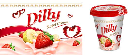
Dilly Ice Cream
Nothing says client satisfaction better than a collaborative relationship for a quarter of a century. Dilly Sweet ice cream has been one of our oldest clients. We created a logo design along with a package label and cover design for them, keeping in mind their target audience and potential customer base.
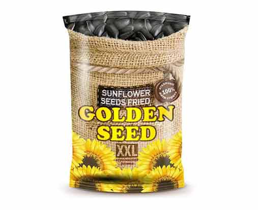
Golden Seeds
One of the oldest names when it comes to fried seed snacks, Golden seeds, was looking for a makeover and were looking for trendy brand identity designs. Hence, we created refreshing designs that matched their needs and helped them with reinventing their brand.
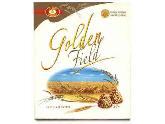
Golden Field Chocolates
Golden Field Chocolates have been one of the bestsellers for the parent brand, Chocolate Factory. As a design agency, we tried to capture all that Golden Field Chocolates offers with this charming and inspired package design.
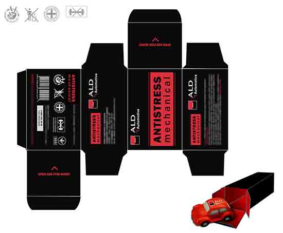
Automobile
One of the most challenging projects can be creating quintessential designs are used for years without losing their essence. This was one of those projects, but we are proud that this eye-catching design became a reality and left our client thrilled.
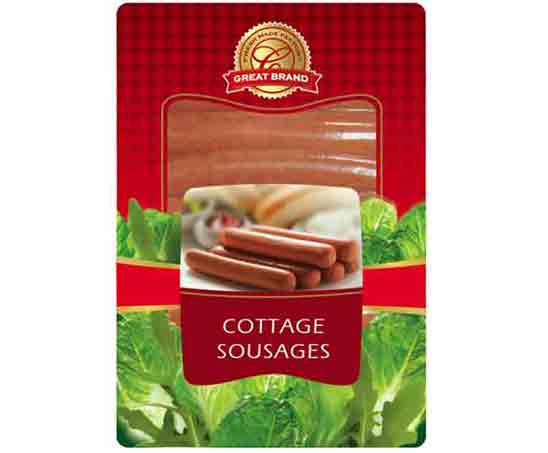
Cottage Sousage
There is a lot of thought that goes into creating a package or graphic design that complements the brand’s principles. With this design, we wanted to preserve the handmade aesthetic of the brand, Cottage Sousage whilst adding that tantalizing edge to it that would boost their sales.
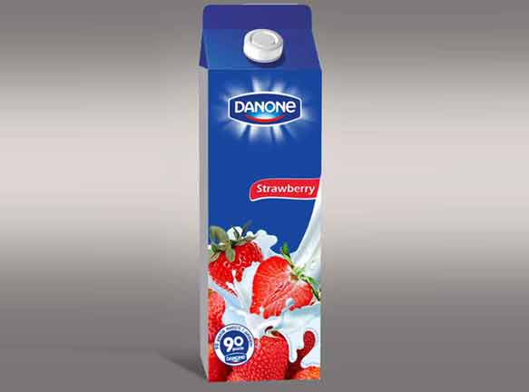
Danone
Some logo designs stand out with their simplicity. Considering the quality and standards associated with this brand, we wanted to design something that won’t take away the focus from those elements. The pleasing fruit images connected with the product while creating an inviting visual which appealed to the client as well as the audience.
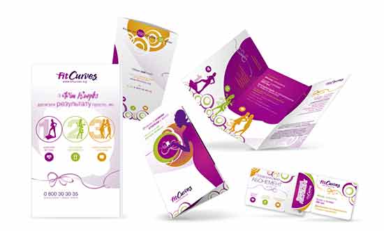
Fit Curves
A great design can go a long way in making a brand stand apart from its competition. Fit Curves focuses on keeping young females healthy and we wanted to present just that. The fresh combination of colors and textures, complementing the company logo, while maintaining the essence of the products brought our vision to life and helped the brand stand as well.
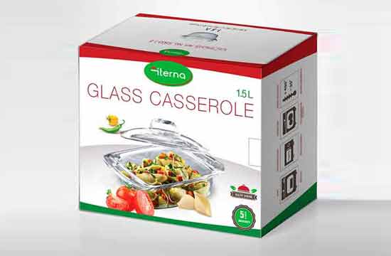
Iterna cookwear
Iterna Cookware believes in providing its customers clean and high-quality utensils to enhance their cooking experience. We wanted to give them a design that aligned with that philosophy. Adding fresh food images and bright colors made the design appealing and eye-catching. We wanted something that makes their customers get to cooking as soon as they get hands on their product.
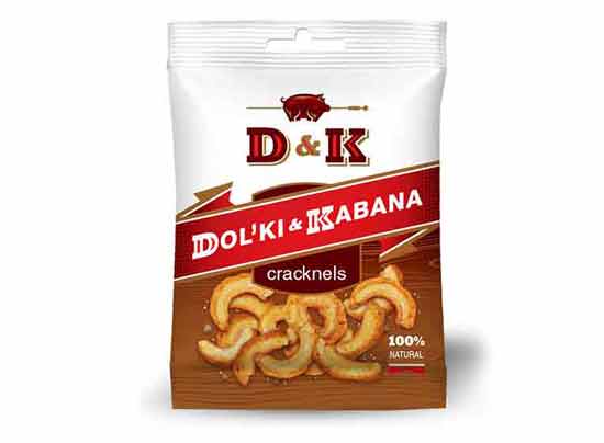
D & K Crunches
Although D&K Crunch was already a well-established name in the industry when they decided to hit the retail space, they needed something to give them an advantage over the competition sitting on the shelves. At Brandliter, we were able to transform what they envisioned and deliver with this beautiful design.
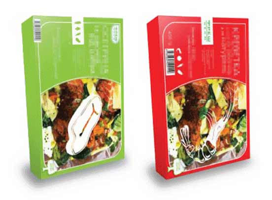
SEA FOOD
Packaging design is not just about making the product look pretty, however that should never take a backseat. We often face challenges in designing packages that look great and keep the product fresh for longer. The design for Seafood was a result of the collaborative efforts of our team that developed a preservative guide and a creative brand style that stays relevant for years.
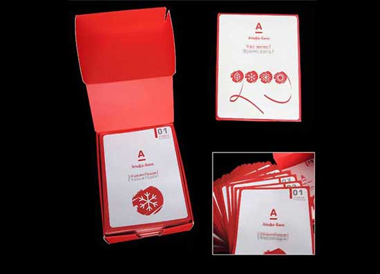
Custom box
Sometimes small gestures and features make the biggest impact on a brand and its sales. This revolutionary idea reinforced this belief and the audience loved it. After all, what’s better than a happy customer? We incorporated a small note in the packaging to bring a smile on the face of the customers who bought the product.
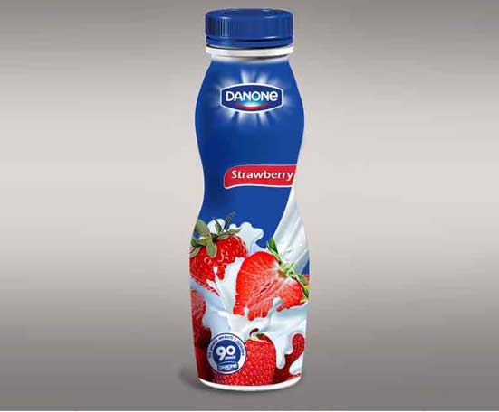
Danone
In order to maintain the brand’s simplicity and yet make the bottles attractive, we tried to keep the design clean and minimal. And instead of adapting a generic design, we incorporated the brand’s belief of fresh ingredients.
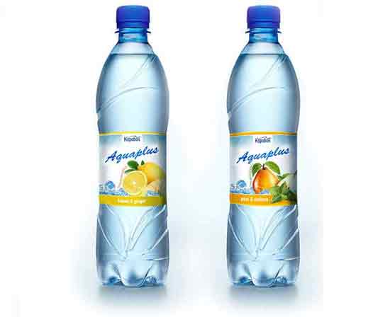
Aquaplus
Another design that needed to stand out from the rest in the crowd of its competitors. We added a splash of color in the form of fruit images that complimented the famous logo while adding to the label’s visual and aesthetics.
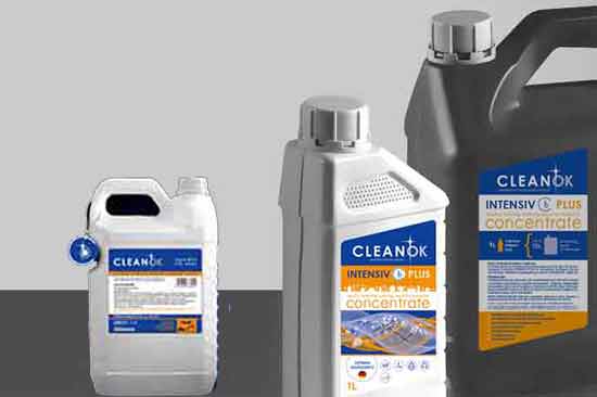
Clean OK
An established brand name, when it comes to cleaning products, Clean OK wanted something that was simple, practical and attractive for their packaging. Using plastic containers was suitable to keep the product storable and helped the manufacturer keep the costs low. At Brandliter, we focus on the usability, costs as well as the brand image when we create a design.
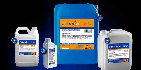
Clean OK
When a brand has a huge product line, the packaging, in addition to being useful and attractive, should also portray consistency. The designs must be similar, showcase the business logo and yet create an independent identity for the individual product. That’s exactly what we did in this case.
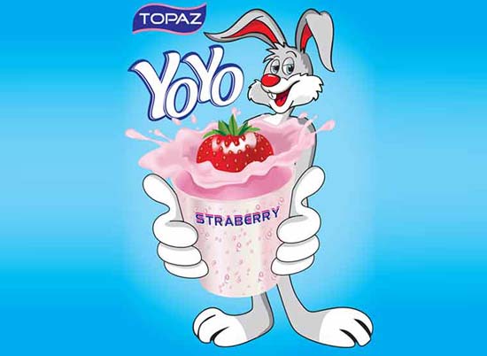
Topaz Yoyo Lable
Topaz has always been known for its cool logos in the food and beverage industry. We wanted to preserve the same vibe and add even more fun elements to attract their younger audience.
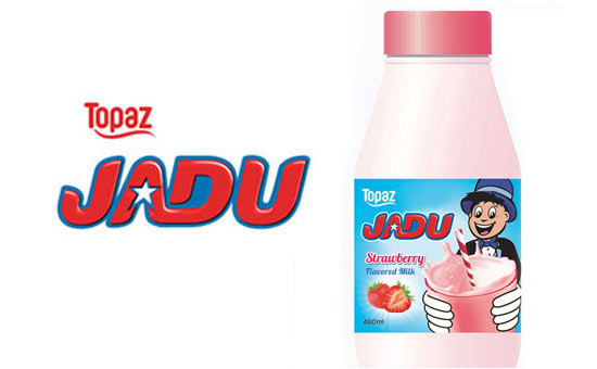
Topaz Jadu Lable
We created another variation for the milk containers of the brand by adding vibrant colors, cartoon characters, and fun font with stunning typography. .
In times of retail as well as online shopping, you need all the help you can get in the terms of logo design, website design, and packaging design. With Brandliter, you can leave the worrying to us and let the designs do all the talking!
Contact Us